
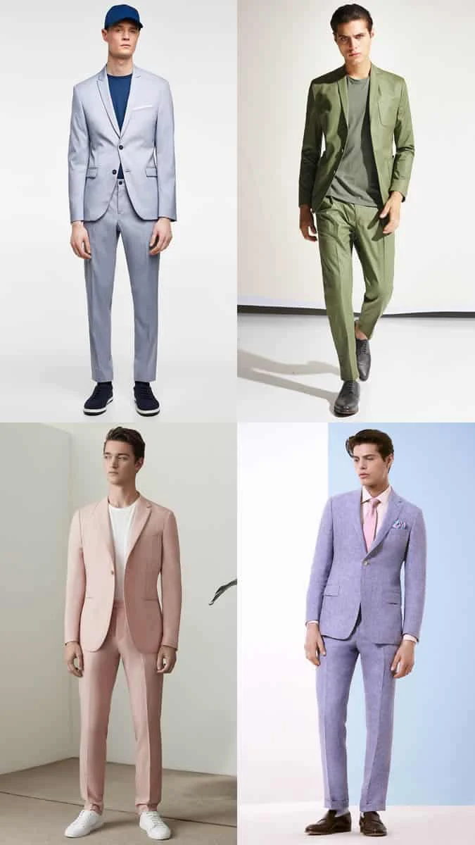
The enduring dominance of neutral palettes in menswear—black, navy, charcoal, and grey—has long served as a safety net for the style-conscious. These shades offer a reliable, versatile foundation that minimizes the risk of sartorial error. However, a significant shift in the global fashion landscape has signaled a departure from this monochromatic rigor. Industry data suggests that retailers and high-end fashion houses are increasingly leaning into a "softened" aesthetic, prioritizing pastel palettes that signify a broader move toward expressive, seasonally fluid dressing.

The Evolution of the Pastel Trend
The historical association of pastel colors with specific socio-cultural periods is well-documented. In the 1920s, the "Jazz Age" saw an influx of lighter, optimistic tones as a reaction to the somber post-war period. Similarly, the 1980s served as a watershed moment for vibrant, candy-colored suiting, popularized by television icons and high-fashion runways alike.
In the contemporary context, the resurgence of pastels is less about a nostalgic revival and more about the evolution of modern masculinity in clothing. Stylist Kenny Ho, who has curated looks for high-profile figures including Luke Evans and Dominic Cooper, notes that the current demand spans from mass-market retailers to bespoke luxury houses. This democratization of color suggests that pastel tones are no longer relegated to resort wear or niche fashion circles, but are becoming an essential component of the everyday professional and casual wardrobe.

Scientific and Stylistic Foundations of Color Selection
The successful integration of pastels into a man’s wardrobe requires more than a simple aesthetic choice; it demands an understanding of color theory and individual complexion. Professional stylists categorize complexions into two primary undertones: cool and warm. A common diagnostic tool involves observing the appearance of veins on the wrist; blue-toned veins typically indicate a cool complexion, while greenish tones suggest a warm complexion.
This distinction is critical when selecting the appropriate pastel shade. Colors on the opposite side of the color wheel generally complement one’s natural skin tone. Furthermore, the distinction between "soft" and "hard" pastels is vital for maintaining visual balance. Soft, muted pastels—often appearing washed out—can sometimes diminish the features of those with fair skin. In such cases, industry experts recommend opting for more saturated, "harder" pastels such as vibrant coral or deep pistachio. Conversely, individuals with olive or medium-toned skin often possess the natural contrast required to carry softer, lighter hues like mint green or lilac with ease. Darker skin tones remain the most versatile, as they typically complement the entire spectrum of the pastel range without the risk of the wearer appearing washed out.

Strategic Styling: Beyond the Basics
The transition from monochrome to a more colorful wardrobe requires a deliberate approach to garment fit. Fashion analysts point to a common stylistic pitfall: the combination of vibrant color with overly restrictive, skinny-fit tailoring. This pairing often disrupts the intended elegance of the outfit, creating a disproportionate silhouette.
To achieve a balanced look, contemporary styling trends emphasize "looseness" in fit. Tailored blazers, slim-fit—but not skin-tight—chinos, and Bermuda-style shorts allow the pigment of the fabric to function as a focal point rather than a distraction. Maintaining a clean, sharp silhouette ensures that the color serves to elevate the outfit rather than overwhelm the wearer’s frame.

Workplace Integration and Professional Dress Codes
The adoption of pastels in professional environments requires careful navigation of existing dress codes. In corporate settings where traditional suiting remains the standard, the introduction of color should be subtle. Industry standards suggest limiting the use of pastels to accessories—such as a silk tie or a pocket square—or opting for muted shades in high-quality fabrics.
For less rigid, smart-casual environments or summer-season events, the rules are significantly more lenient. A pastel suit, when styled with a crisp white T-shirt and minimalist sneakers, represents a sophisticated, modern interpretation of professional dress. This "smart-casual" approach allows for personal expression while adhering to the underlying expectations of a professional gathering.

The Five Pillars of Pastel Implementation
The integration of these shades into a wardrobe can be broken down into five distinct categories:
- Tailored Suiting: The hallmark of a confident dresser is the ability to pull off a sorbet-toned suit. To avoid the dated aesthetic of the late 20th century, designers advise opting for modern cuts, such as a four-button double-breasted jacket or a slim-fit single-breasted design. Summer-weight wools and cotton blends are preferred over linen, which tends to wrinkle and lose structure, to ensure a crisp, polished appearance throughout the day.
- Streetwear Adaptations: The modern streetwear sector, traditionally dominated by black, khaki, and navy, is undergoing a color shift. Introducing a mint-green sweatshirt with distressed denim or pairing lemon-colored footwear with classic staples provides a bridge between traditional streetwear and contemporary color trends.
- Tonal Layering: The "ton sur ton" (tone-on-tone) approach involves layering different shades of the same color family. This technique requires a nuanced eye for detail. By utilizing varying intensities of a single hue, a wearer can create a cohesive, monochromatic outfit that feels intentional and sophisticated.
- Smart-Casual Transitions: A proven style hack involves taking a standard smart-casual outfit and replacing one anchor piece with a pastel alternative. Swapping a navy blazer for a powder-blue version or a grey knit jumper for a soft yellow one can instantly update the entire tone of the outfit without requiring a total wardrobe overhaul.
- The Preppy Update: Traditional Ivy League styling is being redefined through the use of subdued pastel tones. Replacing classic collegiate colors with muted versions of pink, lavender, and sky blue allows for a modern take on the preppy aesthetic that feels at home in both academic and urban settings.
Investment Pieces: A Curated Selection
When building a pastel-forward wardrobe, focus on high-utility items that offer longevity.

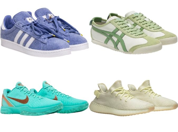
- Footwear: Minimalist tennis shoes in pastel tones offer a refined way to introduce color. Retro classics are generally favored over bulky, athletic-style sneakers, which can sometimes appear childish when rendered in lighter shades.
- Shirts: Oxford shirts and Cuban-collar shirts remain the most versatile pieces. For formal occasions requiring a tie, stick to sky blue or soft pink. For casual wear, more vibrant, experimental tones are acceptable.
- Accessories: If you are hesitant to commit to large garments, accessories offer the lowest barrier to entry. A baseball cap, a pair of subtle socks, or a pocket square can introduce a necessary pop of color without overwhelming your overall ensemble.
- Chinos: Moving away from stone and khaki, slim-cut chinos in washed-out shades of green or blue provide a fresh alternative for spring and summer rotations.
- Sweatshirts: As a staple of casual menswear, the sweatshirt is an ideal canvas for color. For active wear, opt for bold logos on vibrant pastels; for social or professional-adjacent settings, choose plain, softer fabrics.
Broader Economic and Fashion Implications
The shift toward pastels is reflective of a larger movement in the fashion industry toward "optimistic dressing." Following several years of global uncertainty and a reliance on protective, neutral clothing, consumers are increasingly seeking out garments that convey joy and vitality. From an economic standpoint, this trend has prompted manufacturers to expand their production palettes, resulting in a more diverse range of options for the average consumer.
Data from recent retail performance reports indicate that brands that have successfully incorporated pastels into their collections have seen a marked increase in customer engagement. By offering guidance on how to style these pieces, brands are effectively lowering the barrier to entry, encouraging consumers to experiment with color in a way that feels accessible and grounded in established fashion principles.
As with any shift in style, the key to wearing pastels effectively lies in balance and personal comfort. By adhering to the principles of color theory, maintaining proper fit, and selecting the right context for each piece, men can successfully integrate these shades into their wardrobes, ensuring a look that is both modern and timeless. The era of the "all-neutral" uniform is not necessarily coming to an end, but it is certainly making room for a more vibrant, nuanced, and colorful future.
